Drawing
Edge activity plots
The visualization of temporal networks is an area of active research.
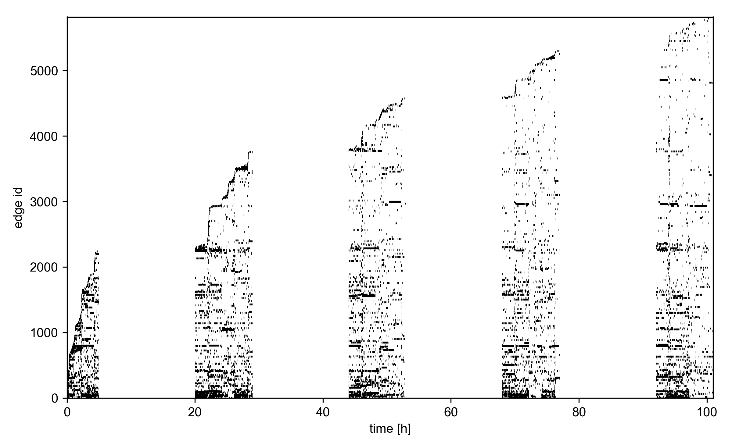
tacoma’s contribution is a so-called edge activity plot, where
edges are attributed to an integer id, sorted for their order of
appearance. Then, each edge is drawn as a bar for the duration of
its existence (active time periods, respectively).
This is closely related to the representation of
a temporal network as a list of active intervals,
_tacoma.edge_trajectories. The function to draw
edge activity plots is _tacoma.edge_activity_plot().
Here’s some example code
import os
import tacoma as tc

from tacoma.drawing import edge_activity_plot
import matplotlib.pyplot as pl

if not os.path.exists('~/.tacoma/hs13.taco'):
    hs13 = tc.download_and_convert_sociopatterns_high_school_2013()
else:
    hs13 = tc.load_sociopatterns_high_school_2013()

edge_activity_plot(hs13,
                   time_normalization_factor = 1/3600.,
                   time_unit='h',
                   alpha = 1.0,  # opacity
                   linewidth = 1.5,
                   )

pl.show()

Edge activity in the temporal network Sociopatterns high school 2013.
An edge activity plot is useful since it conveys a lot of information in the data visually. Occurences of longer horizontal bars show that there’s likely broad contact duration distribution. Vertical bars show that there’s increased activity during a certain period of time over the whole network. Edges from groups tend to be observed for the first time at the same time so naturally clusters are observed as recurring broad bars.