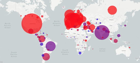
Covid-19 Dynamics on a Global Scale
This interactive visualization illustrates the dynamics of the COVID-19 pandemic since January, 2020 until now on a global scale. The world map shows the number of cases by country as a function of time. This interactive visualization was inspired by the great Hiroki Sayama and his COVID-19 videos of the dynamics of the pandemic. This interactive version was created by Olivia Jack in the ROCS-Team. The animation is updated continously with new data coming in.
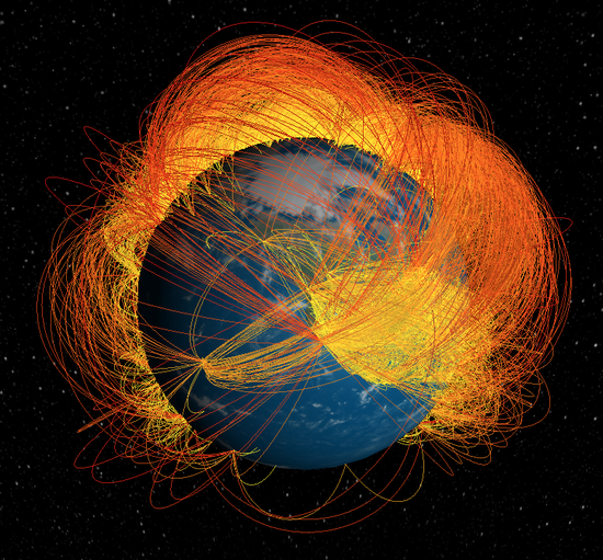
Global Mobility Visualization
This interactive visualization illustrates the worldwide air-transportation network. The network connects approx. 4000 airports globally with roughly 51000 connections. On this network more than 3 billion passengers travel each year. In total humanity travels a total distance of over 15 million kilometers every day (under normal conditions), that is roughly three times the radius of our solar system.
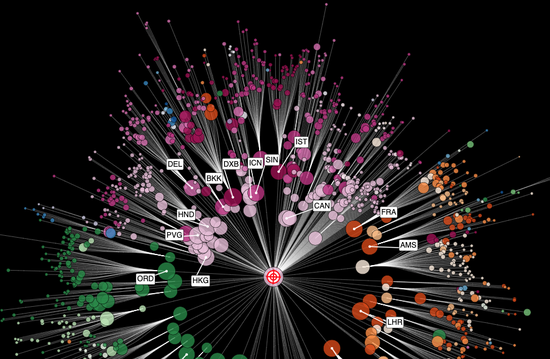
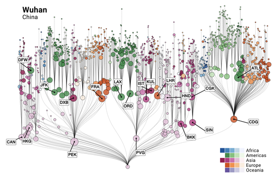
Spreading Routes on a Global Scale
This interactive visualization illustrates the most probable spreading routes of a pandemic with and arbitrary initial outbreak location that you can choose. The visualization implements the ideas of series of papers that introduce and discuss the concept of effective distance in complex, network-driven contagion phenomena.

Epipack
Fast prototyping of epidemiological models based on reaction equations. Analyze the ODEs analytically or numerically, or run/animate stochastic simulations on networks/well-mixed systems. Simple compartmental models of infectious diseases are useful to investigate effects of certain processes on disease dissemination. Using pen and paper, quickly adding/removing compartments and transition processes is easy, yet the analytical and numerical analysis or stochastic simulations can be tedious to set up and debug—especially when the model changes (even slightly).
COVID-19 - Event Horizon
The Covid-19 Event Horizon Project was inititated during the onset of the pandemic in the spring of 2020 when the pandemic was predominantly unfolding in mainland China. The project had two independent elements, each containing a predictive model. One model assessed the import risk of SARS-CoV-2 in different countries based on the global air-transportation network. The second dynamical model (SIRX) assessed the contaiment measures on the dynamics of the time course of the pandemic.
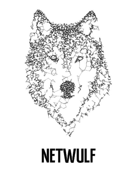
Netwulf
Simple and interactive network visualization in Python. Network visualization is an indispensable tool for exploring and communicating patterns in complex systems. Netwulf offers an ultra-simple API for reproducible interactive visualization of networks directly from a Python prompt or Jupyter notebook. As a research tool, its purpose is to allow hassle-free quick interactive layouting/styling for communication purposes.

Complexity Explorables
This project is designed for people interested in complex systems and complex dynamical processes. Complexity Explorables hosts different collections of interactive illustrations of models for complex systems in physics, mathematics, biology, chemistry, social sciences, neuroscience, epidemiology, network science and ecology. Topics include pattern formation, synchronization, critical phenomena, chaotic dynamics, evolutionary dynamics, fractals, collective behavior, reaction-diffusion systems and more.
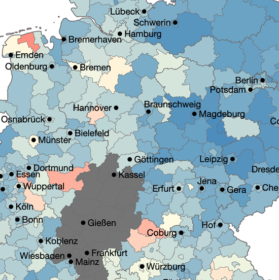
VacMap
VacMap is an interactive visualization of the vaccination status in Germany. VacMap conveys a qualitative and quantitative representation of the vaccination coverage at the regional resolution.