Spreading Routes on a Global Scale
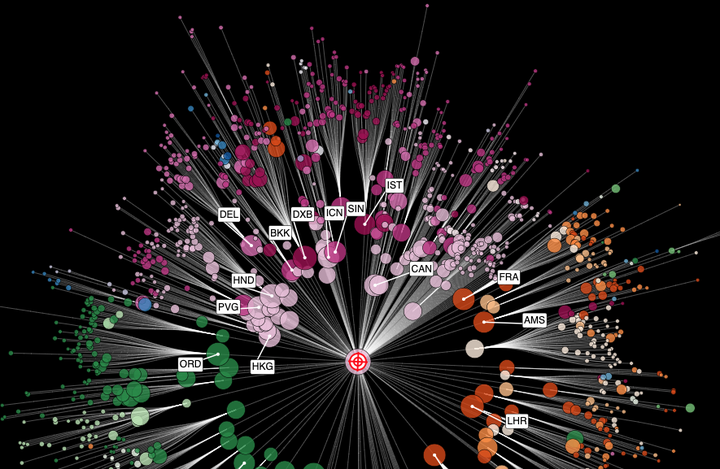 Most Probable Spreading Route on the Worldwide Air-Transportation Network
The visualization
You can start and explore the visualization by clicking this button
In order to appreciate it and understand what’s going on, however, you may want to read the background information below.
Background
In 2013 Dirk Brockmann and Dirk Helbing published a paper in Science (The hidden geometry of complex, network-driven contagion phenomena, Science 342 (6164), 1337-1342 2013) ) in which they showed that spreading processes that unfold on heterogeneous networks can be understood better, if the notion of conventional distance is replaced by an effective distance that is derived from the strength of the connections in the network.
For example, if you want to understand how a pandemic spreads on the worldwide air-transportation network traditional geographic distance, which is the foundation of traditional maps that we look at every day, is replace by effective distance, we can understand the spreading patterns better. Roughly speaking, the effective distance from an airport A to B is large if few people travel from A to B, and it is small if a lot of passengers travel from A to B. Under the hood, it’s a bit more complicated than this, but never mind the details. If you are interested in the details, have a look at the paper.
When viewed on a traditional map, real pandemics or computer simulated versions typically exhibit spatially incoherent and complicated patterns, because the worldwide air-transportation network connects places that are very far apart and also because the mobility network has a very complicated internal structure. You don’t see generic traveling waves, that you may expect if no long-range traffic would occur.
However, if you let go of the traditional way of looking at these pattern, replace geographic distance by effective distance, the spreading patterns turn into generic traveling waves, as you can see in this video.
The video illustrates a computer simulated hypothetical pandemic with an initial outbreak location in Atlanta in the USA. Both panels show the same simulation. The right panel illustrates the spreading pattern in the conventional map. The left panel, shows the pattern using effective distance, which in this case is the distance to the origin.
The tree-like structure that you see compiles the most probable spreading routes. And these routes are illustrated in the interactive visualization.
References
Science 342 (6164), 1337-1342 (2013).