New Monitor: Contact patterns during the Pandemic
In addition to mobility, we now show the average contacts in the population over time—with equally important insights into the course of the pandemic.
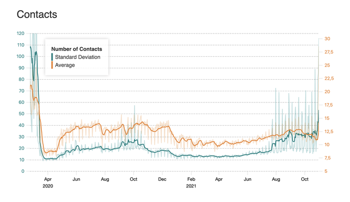
The mobility of people gives us an important overview of the pandemic, but it is actually the contacts between people that are instrumental in the infection dynamics: Transmissions occur when people meet.
With the new contact monitor we make these contacts visible. The monitor shows the average number of contacts that a person in Germany had on a given day.
You can clearly see how strongly contacts have decreased in March 2020, and how they are still at a low level more than a year after the start of the pandemic. Also visible are the different phases of the pandemic and reactions to it with lockdowns, relaxations, holidays and vacations.
The number of contacts is calculated from GPS mobile phone data and provided to us as an anonymous, aggregated statistic - more on the methodology here.
We will continue to analyze contact dynamics and investigate what conclusions can be drawn about infection dynamics. For example, in the study Ruediger et al., contacts were shown to be related to the reproductive number R.
Frank Schlosser
PhD Student
I’m currently researching human mobility and its relation to epidemic spreading
Pascal Klamser
PostDoc
My research interests include collective animal behavior, evolution, phase transitions, disease and opinion dynamics on networks.
Adrian Zachariae
PhD Student
My research interests are dangerously widespread and include evolutionary dynamics, human mobility and honey bee social networks.